
The Riskdial is a distillation of intermarket measurements between hundreds of assets (such as S&P500 (SPY) to Bonds (TLT)) as well as price and volatility relationships during the trading day, scored to one single number. This score serves as a definitive measure to determine whether investors are favoring risky assets, primarily equities (Risk-On) or defensive assets, primarily bonds (Risk-Off). For an explanation of why we use spread ratios, please view this video where I evaluate the relationship between Apple Shares, Cash and Bonds.
The purpose of the Riskdial is to guide investors during turbulent times by signaling when to exit high duration equity investments (Risk-Off phase) to avoid potential portfolio allocation mistakes caused by heightened volatility. Its primary goal is to provide peace of mind rather than predict market tops and bottoms. Each day, the Riskdial needle points to the most suitable asset allocation for the given market conditions.
The Riskdial is a short-term momentum indicator that can exhibit significant fluctuations from one day to another. To identify the overall trend of Risk-On or Risk-Off, the model utilizes moving averages. Risk-Off periods are visually represented in grey within the model, while Risk-On periods are displayed in white. When the short moving average crosses above the long moving average, it signals a shift to Risk-On, and conversely, when the short moving average crosses below the long moving average, it indicates a shift to Risk-Off. For a sample of the daily model report, you can refer to the provided link: Model Report

The Riskdial model has a simple allocation of either SPY or Cash. The equity curve and drawdown “Buy and Hold” and “Benchmark” instruments are both SPY.
There are a few ways to spot check whether the Riskdial is working on par to history.
First you can look at the drawdowns chart. If current drawdowns are within historical norms it is likely the Riskdial is performing normally.
Secondly, and more importantly, the Riskdial works by identifying which assets are more likely to outperform at any given moment — Risky Assets or Defensive Assets.
Given that the Riskdial fundamentally works off spreads, to know whether or not it is working properly, we can simply compare the performance of Risk-On / Risk-Off spreads since the last investment date, as well as compare the current average performance to past average performance.
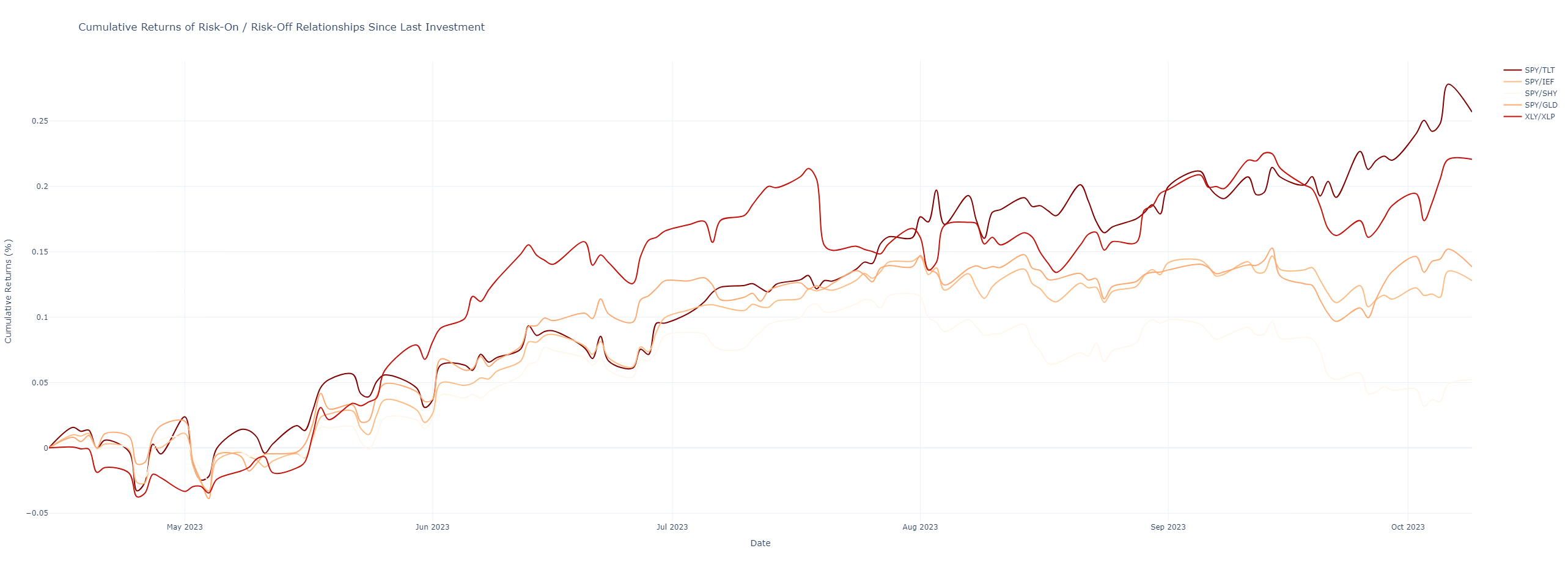
The first chart below shows 5 classic Risk-On to Risk-Off spreads. SPY to TLT (long term bonds), SPY to IEF (intermediate term bonds), SPY to SHY (short term bonds), SPY to GLD (Gold), and XLY to XLP (Consumer Discretionary to Consumer Staples). If the model is working as expected in a Risk-On environment, the Risky assets should all be outperforming the Defensive assets on a cumulative return basis. That is shown precisely in the chart below.
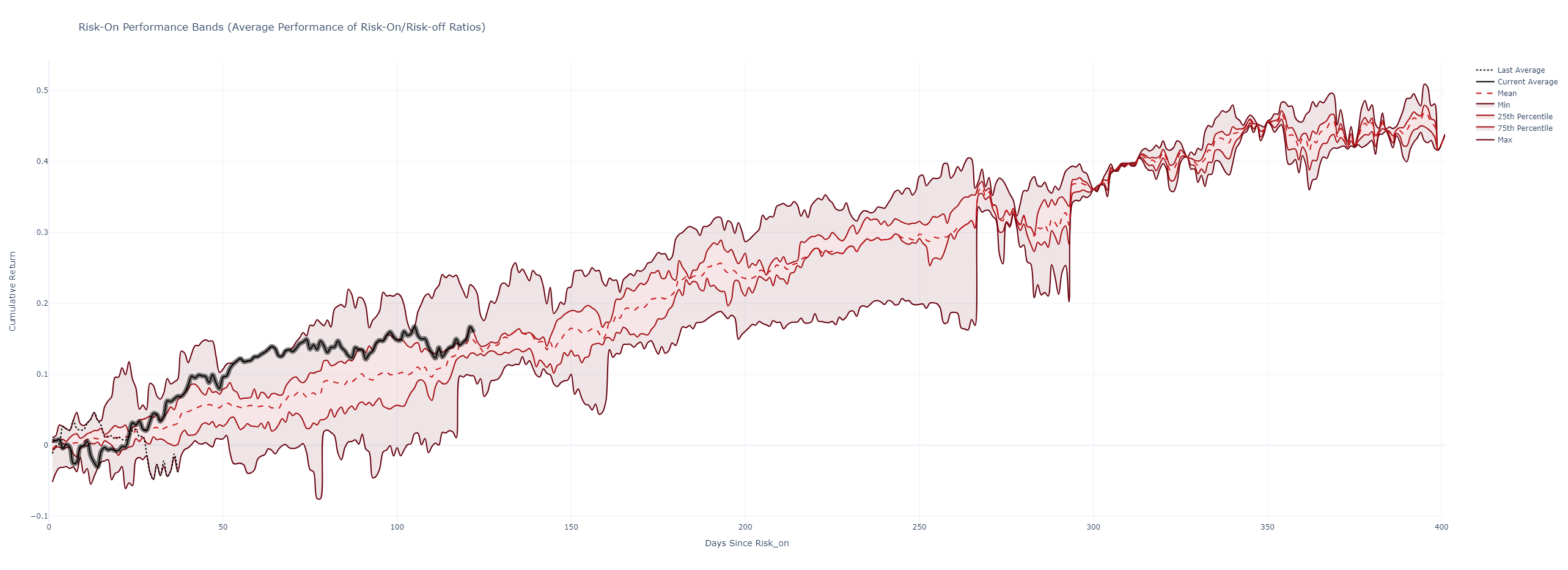
Similarly, we should be able to contextualize the current average relative performance of the model compared to historical Risk-On periods. The chart below is non-statistical in nature and is only meant to compare present to past. The top and bottom lines represent the maximum and minimum relative returns to an average basket of defensive assets. Then we show the 75th and 25th percentile lines in lighter red. The dotted red line is the mean return line. The thick black line represents the current Risk-On period. In the chart below, which was made on October 9th, 2023, we can see that we are about 120 days into the Risk-On regime and Risky Assets are outperforming Defensive assets by about 17%, or in line with the 75th percentile line of past Risk-On environments. The model is working as expected.
Finally we show a third chart which shows the expected underperformance during Risk-Off periods. When the model is in Risk-Off, this chart will receive a thick black line to denote the current Risk-Off performance. During Risk-Off we should expect Risky Assets to underperform Defensive assets. The chart below shows this. On average 50 days into the Risk-Off regime, Risky Assets have underperformed defensive assets by 5%.
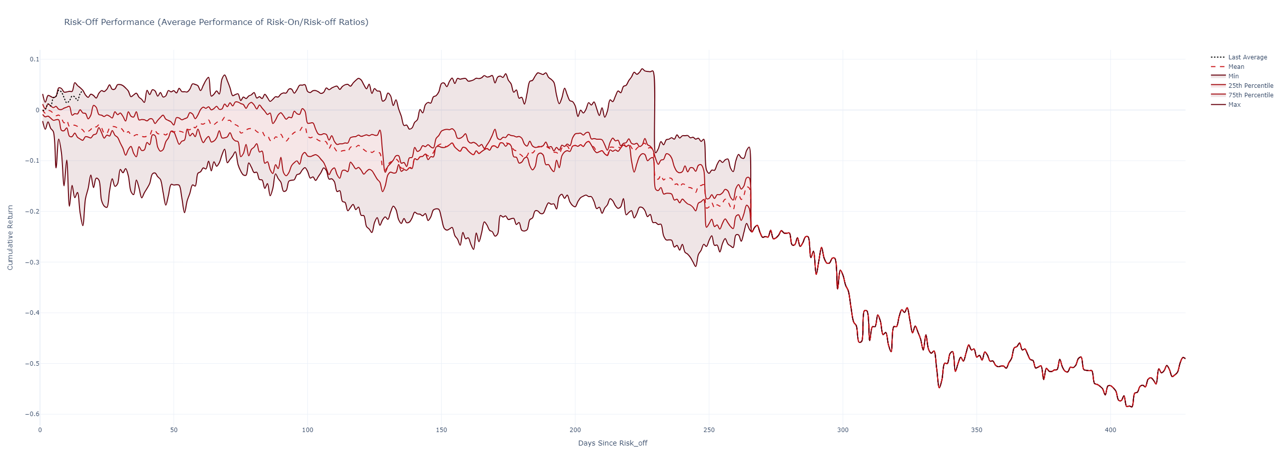
The more days that pass for a given regime, Risk-On or Risk-Off means there is lesser data. There are very few regimes that have lasted for more than 250 trading days.
The Spread Ratios Report is an analysis of the fundamental components of the Riskdial model. It serves to clarify the reasons behind the current scoring of the Riskdial as well as to reveal which assets (Risk-On or Risk-Off) are being favored by investors and highlights important changes and anomalies.
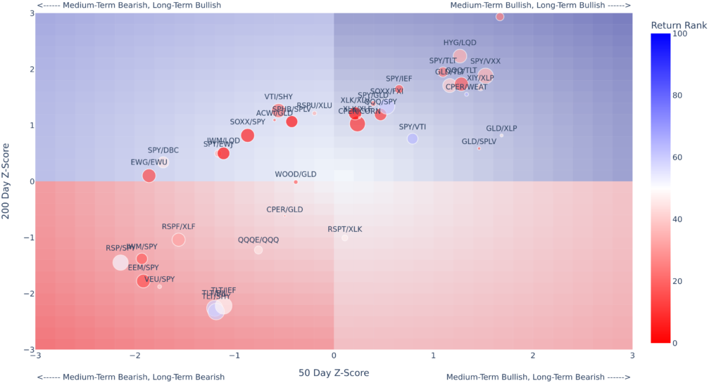
The report takes a top down approach, first giving an overview of all the ratios we track and shows how they are trending on short, medium and long term timeframes via a grid which classifies each ratio into bullish, bearish, or neutral trends. Below is an image of the second page of the spread ratios report. There are three main aspects to the information provided in this chart.
Trend
The grid splits trends into four categories as labelled in the chart above and highlighted by the background colors. The X and Y axis are both Z-scores, effectively standardizing the distance a given ratio is trading at in relation to it’s 50 day moving average (x axis) and 200 day moving average (Y axis). As such, the deepest blue and red indicate the most bullish trend (above both 50 day and 200 day moving averages) and most bearish trend respectively (below both 50 day and 200 day moving averages). The more neutral blue and red indicate that one of the trends is different from the other. As each quadrant converges to the middle of the plot the shading lightens to indicate a more potentially more neutral trend. Ratios that are trading near the center of the chart imply that they are near to both the 50 Day and 200 day moving average.
In the grid shown above the majority of the risk-on risk-off intermarket spread ratios fall into the Risk-On (Medium-Term Bullish, Long Term Bullish) quadrant — they are trading above both their 50 day moving averages and 200 day moving averages respectively. As such, this suggests the Riskdial should be strongly positive. The chart also shows many of the Risk-Off to Risk-Off Ratios (eg. TLT/SHY) and Equal Weight ratios (eg. RSP/SPY) trending strongly bearish.
Bubble Size – Volatility Rank
The size of the bubble highlights ratios that are experiencing higher or lower than normal realized volatility. Each ratio’s 21 day realized volatility is ranked based on the past 100 trading days. As such, the smallest bubbles indicates the lowest volatility and the largest bubbles the highest volatility. In the chart above commodities appear to be experiencing outsized short-term volatility eg. CPER/CORN, while a stock bond relationship SPY/TLT appears to be experiencing particularly low volatility. The bubble sized is an important factor to consider as increased relative volatility may be seen during narrative shifts and or trend reversals.
Bubble Color – Return Rank
The bubble color shows if a particular ratio is experiencing an anomalous return on any given day by ranking the current day returns against the past 100 trading days. In the chart above equal weight ratios like QQQE/QQQ and RSP/SPY appear to be experiencing strongly positive one day gains, while many of the technology ratios are experiencing strongly negative one day gains. Like the bubble size, relative returns are more likely to be large during narrative shifts and or trend reversals.
Volatility Attributions
The volatility attributions charts, through time, pin-point which groups of ratios are experiencing anomalous volatility as depicted by a elevated Average Component Volatility Rank. These charts also highlight which ratio groups are contributing to or remaining unaffected by these fluctuations. The chart is annotated to display where a group of ratios experienced its most significant volatility and shows the current average volatility for each group of ratios.
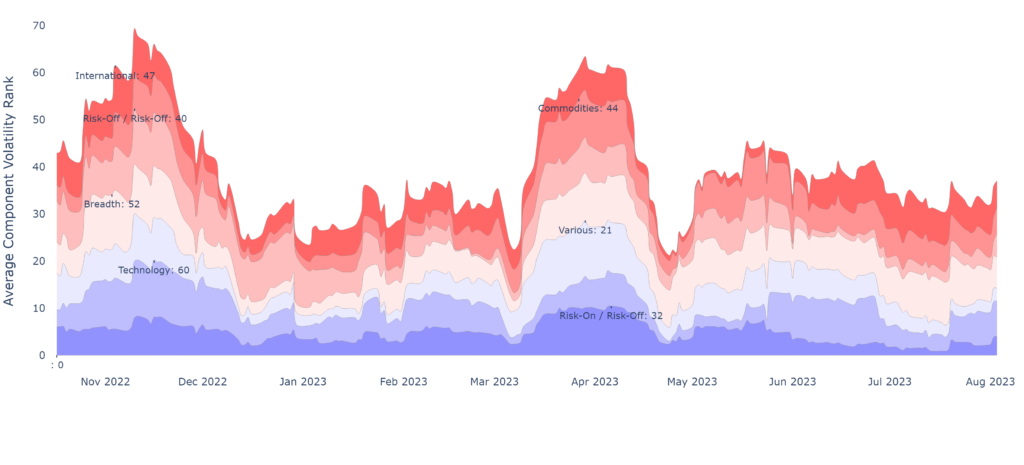
Average Component Volatility Rank
The top line of the first attribution charts represents the average component volatility rank, calculated as the mean of the 100-day volatility rank of all ratios. The visual representation, created by stacking these groups, aids in identifying unusual volatility patterns. Anomalous volatility becomes evident under two specific conditions.
- Anomalous Low Volatility: A diminishing width in a ratio group signifies low volatility and a stable trend.
- Anomalous High Volatility: An expanding width in a ratio group indicates high volatility and a unstable trend.
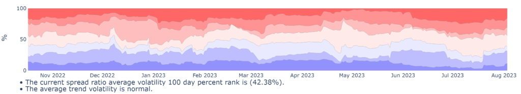
% Component of Average Volatility
The second chart depicts the specific contribution in % of each ratio group to the collective average component volatility rank. This representation is designed to identify anomalies and clarify attributions that may be subtle in the primary chart.
Rest of Report
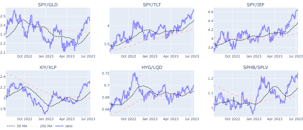
The report is then broken out to give a more granular view of each of the ratios by ratio category via individual charts. Shown below is an example of the Risk-On to Risk-Off ratio page. It includes ratios such as S&P 500 to Gold (SPY/GLD), S&P 500 to long-term Bonds (SPY/TLT), S&P 500 to medium-term Bonds (SPY/IEF), Consumer Discretionary to Consumer Staples (XLY/XLP), High Yield Bonds to Investment Grade Bonds (HYG/LQD), and High Beta Stocks to Low Volatility Stocks (SPHB/SPLV).
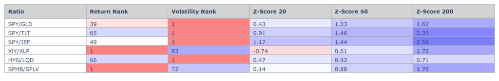
Finally, below each chart you can find a Summary Table which provides an overview of changes and anomalies in the tracked ratios. All of the data presented for the ratios on the first two overview pages in presented in these tables — the visuals are synthesized into their raw data numbers. The first two columns present both the 1 day return rank and the volatility rank. A return (volatility) rank of 100 indicates the highest return (volatility) in the past 100 trading days and vice-versa. The Z-scores, which were first presented above, offer context by comparing the ratios to their historical averages over 20, 50, and 200-day periods. A “Z-Score 20” above 2 indicates that the ratio is priced above the upper 20-day Bollinger Band, while a ratio below -2 suggests it is priced below the lower Bollinger Band. The table’s color-coded shading, ranging from red to white to blue, helps visualize the magnitude of changes and strength of the trends, with deeper red indicating larger negative changes and weaker trends and deeper blue indicating large positive changes and stronger trends.
For a full view of the report you can view the sample report here: Spread Ratios Report
The Riskdial Model, with its two stances of either Risk-On or Risk-Off, serves as a straightforward guide indicating when it may be favorable to invest in equities. However, this model by itself lacks the details needed to understand market behavior fully. That’s where the research report fills the gap.
Each day, we thoroughly examine the Riskdial Model’s score, dissecting each aspect to grasp what it specifically implies for the S&P 500 in terms of returns, volatility, and risk. This comprehensive analysis allows us to establish realistic expectations for how the market might perform in the future, and how risky an investment may be at any given time.
Chart 1 – Model Score Derived SPY Price Ranges
The first chart, the Model Score Derived SPY Price Ranges presents two main pieces of information, the historical SPY price (candlesticks) and associated model score bin (background heatmap) as well as the forecast based on the model score bin.

- Candlesticks and Heatmap: The candlesticks and heatmap allow a visual representation of historical price and the model score range through history.
- Heatmap Color: The heatmap color denotes the bin that the model was trading in through history. Deeper greens indicate strongly positive model scores while deeper reds indicate strongly negative model scores, on average.
- Model Score Bin Forecast: The model score bin displays a forecast range using a mean return, 95th percentile return, and 5th percentile return.
- Mean Return: The historical average return for the SPY ETF associated with the current model score bin.
- 95th Percentile: Indicates a return that you would expect, based on history, to be exceeded just 5% of the time.
- 5th Percentile: The return that you would expect lower just 5% of the time.
- Color Shading: Positive returns will receive green shading while negative returns will receive red shading. The mean return line is indexed to the 5th and 95th percentile lines – if the range of values between the 95th and 5th percentile returns is large the mean return line is likely to appear a neutral color. This helps explicitly show the lesser significance of the mean return forecast.
Chart 2&3 – Model Score Relative Returns and Volatility Maps
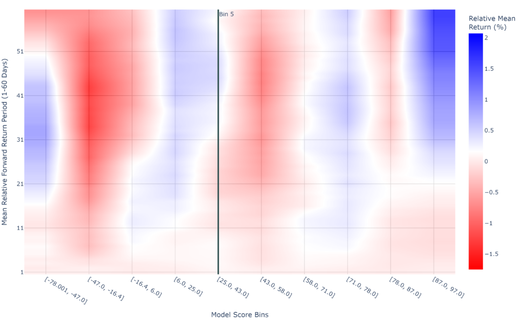
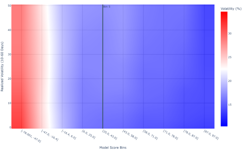
These maps quantify both relative returns (return in excess or deficit of normal SPY returns) and realized volatility (how much price can be expected to move around) for each of the 10 model bins.
- Relative Returns Maps: The relative returns map calculates SPY returns for each day from 1-60 days as well as each model bin. This allows us to very quickly detect where returns may be more positive or more negative than normal, and on what time-period those returns occur on.
- Heatmap Color: Deeper blues indicate stronger positive relative returns. Deeper reds indicate stronger negative relative returns. Lighter blues, whites and lighter reds indicate returns are closer to normal market returns. We can see that the most bullish market bin is also the highest [87 to 97] where the most bearish is the second lowest model score bin [-47 to -16].
- Volatility Maps: The volatility maps calculate SPY realized volatility for each period from 10 day realized volatility to 60 day realized volatility and for each model Bin.
- Heatmap Color: Deeper blues indicates lower realized volatility in a given model score bin. Deeper reds indicates higher realized volatility. We can see that the highest volatility occurs in the two most bearish Model Score bins [-47 to -16] and [-78 to -47] where they are shaded white and red respectively.
Chart 4 to 8 – Model Bin Implied Volatilites
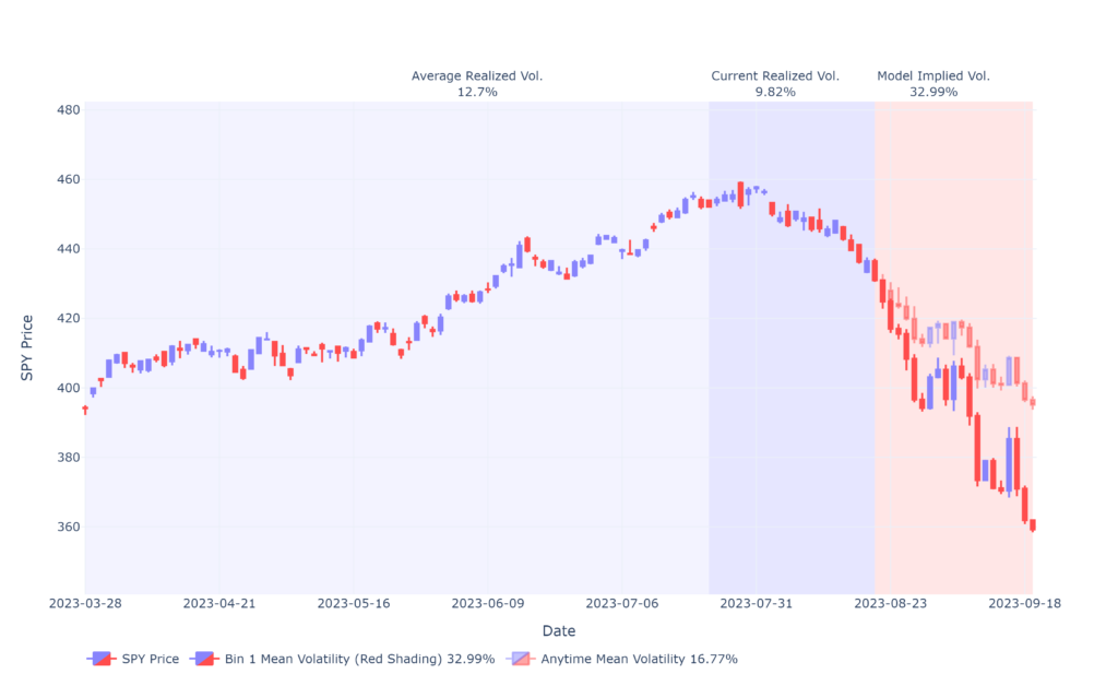
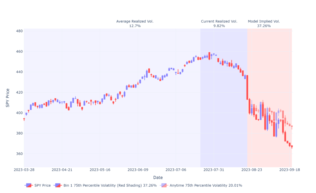
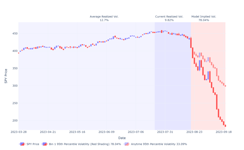
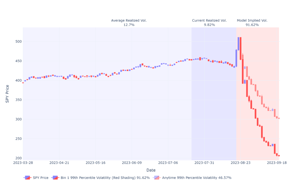
These four candlestick charts simulate expected realized volatility based on the model score bin and compare them to a symmetric scenario of normal market realized volatility. These charts are useful for identifying when expected realized volatility is materially different from normal market volatility. You can see this in the example shown above, the most bearish Model Score Bin. All four charts exhibit materially different volatility forecasts (opaque candles in the red shading forecast) from normal market volatility (semi transparent candles in the red shading forecast).
- The charts presented each show the mean, 75th, 95th and 99th percentile volatilities for the current market bin, respectively.
- Background Color Shading: Each candlestick chart is presented with a light blue (the average realizedd volatility to date (as shown on the chart), a medium blue (the average realized volatility of the past 21 trading days) and a red (the expected realized volatility contrasted to the normal market volatility.
- Candlestick Color Shading: The hostorical candlesticks are presented in the blue/red combination. Similarily the model derived volatility forecast candlesticks are in the same shade. The normal market volatility candlesticks are compared in a translucient shade.
- Candlestick Forecast Divergence: A model Bin is particularly important when it’s volatility forecasts differ materially from the normal market volatility. This phenomenon is evident in both the more bullish and bearish deciles when the candlesticks exhibit significantly different returns and ending points.
Chart 9 and 10 – Model Bin Return Distributions


The Model Bin Return Distributions visualize return assymetries and biases of SPY returns and volatility. Two charts are presented. The first chart depicts SPY 60 day returns for each Model Bin (1-10). The second chart depicts multi-time period returns (1-60 days staggered) for the current Model Bin.
- SPY 60 Day Returns by Model Bin
- This chart shows the point in time SPY returns at 60-days forward broken out in each row by model Bin. The top of the chart shows Bin 10, the most bullish model score range. The bottom of the chart shows Bin 1, the most bearish model score range. A peakier distribution with less values distributed widely amongst the X axis eg. Bin 10 indicates a more predictable bullish distribution. A flatter, wider distribibution is indicative of a more volatile Bin and where point in time estimates are more unpredictable eg Bin 1..
- SPY Multi Period Returns By Current Bin
- This chart filters the data by the current Model Score Bin – and then plots multi period returns from each day from 1 days starggered to 60 days. The chart compares each periods return to the markets normal returns during that period to highlight similarities and anomalies.
The website is updated by 6:50 PM EST each day. The risk-model including the dial score and performance charts, spread ratios, research report and score changes and daily and weekly performance are all updated. You will also receive an email notification of the availability of the daily pdf reports at this time.
To interact with the data from the reports simply login to your account on riskdials.com and navigate to the model page. Here you will receive interactive charts as well as the ability to download data. All of the charts contained in our reports are replicated on the individual application pages and are interactive.
Yes, we will update our models when we believe we can improve their robustness. If we make a model update, it will be reflected on the Riskdial with the current version number. Currently the model is version 1.04 and it was last updated on April 29, 2024.